April 25, 2025
A strong case study in less-is-more packaging design.
You may remember that I got my start in marketing communications at the in-house agency of a craft tofu maker. So, while I always appreciate standout identity and packaging design, I’ve got a special soft spot for soy foods.
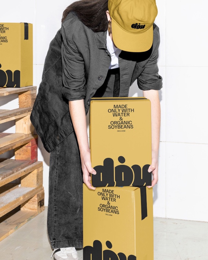
This identity program for Dou Soymilk created by designer, Siyu Shen, stopped me in my tracks. For a brand that emphasizes the simplicity of a product made with just water and organic soybeans, a minimalist design palette is a perfect match.
There are almost as few elements here as ingredients: a gorgeous warm brown that echoes the color of a dried soybean, a logo in a rounded typeface reminiscent of the bean’s shape, and a clean sans-serif font. That’s all it needs. Yummy.
ARTICLE: Dou Soymilk: Bold & Minimal Branding and Packaging Design

