July 18, 2025
Communication
Flipping the script as a company and brand strategy
Mathieu Flamini and Pasquale Granata created GF Biochemicals with a clear mission: to tackle climate change and chemical pollution by creating chemicals that replace harmful petrochemical ingredients found in everyday products such as detergents, paints, and personal care items.
The company approached NOT Wieden+Kennedy with a clear brief: to collaborate on a new brand identity that would assert their leadership and communicate the disruptive nature of their offering in sustainable chemistry.
The agency lived up to their own brand promise. The studio is explicitly positioned to provide design and branding solutions (not advertising alone), making it well-suited for mission-driven, future-facing companies like GF Biochemicals.The typography is modern and sans-serif, evoking precision and trust — attributes often strived for by pharmaceutical or biotech brands. It signals authority and seriousness while being approachable. But the choice to employ a vibrant pink as the primary color emphasizes that the company is very different. It's a unique choice in an industry that typically draws on the blues and greens associated with nature.
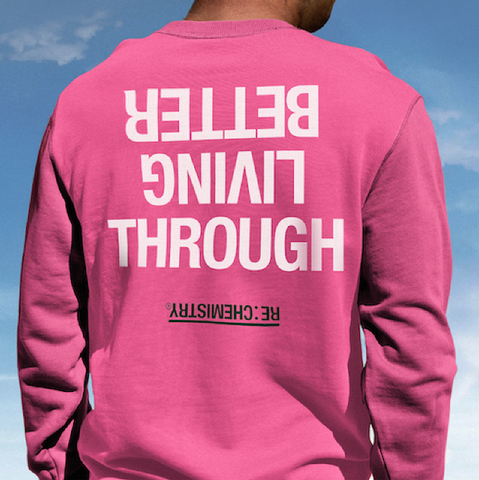
But where the ID system really steps out is how GF Biochemicals (and its flagship product RE:CHEMISTRY) purposefully uses upside down type as a core part of its storytelling strategy. This is not a random design choice: it’s a visual metaphor that sits at the heart of the company’s message. The treatment signals that the company is “flipping the script” on the chemical industry—challenging traditional, fossil-fuel-based products by offering radical, plant-based alternatives.
The result is a graphic design and brand identity system that speaks across disciplines — from biochemistry labs to boardrooms — and positions GF Biochemicals as a global green-tech heavyweight, not another feel-good environmental project.Nice work.
ARTICLE: Not Wieden+Kennedy: Ex-Arsenal Star’s Planet-Saving Company Flips Chemistry Into Greenness