November 29, 2024
Communication
One of the most progressive graphic designers of the 1920s and ’30s, one who challenged traditional conventions, did so at a time when fascism was taking root throughout Europe.
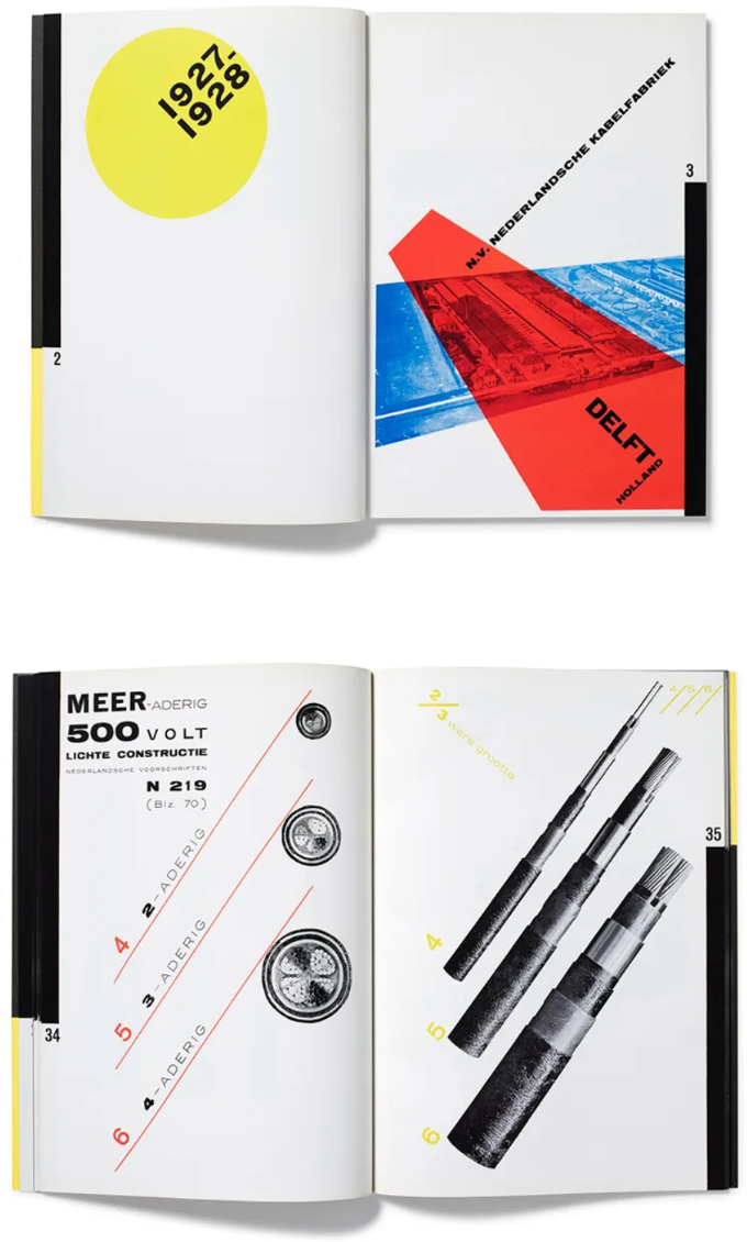
Last week Steven Heller reviewed the Letterform Archive rerelease of a founding masterpiece of modern typography from one of the twentieth century’s most ambitious creatives, Piet Zwart, the Dutch photographer, typographer, and industrial designer. Piet Zwart’s Avant-Garde Catalog For Standard Cables is a faithful reproduction of an industrial product catalog that in Heller's words, ""turned conventionally formatted graphic design for industry on its ear. Inspired by Constructivism and De Stijl, and using stark product photography, photomontage, skewed typography, geometrical shape and repeated word patterns integrated into layers of overlapping primary colors, Zwart produced designs that underscored the argument that the new typography was not some faddish, impractical avant garde experiment but a disciplined, functional document that was accessible for technical (otherwise bland) business requirements.""
His review is worth reading just for his appreciation of Ziet's important influence on the role of graphic design in business communications. But in light of the political reality the whole world is experiencing today, I want to draw our attention to the fact that Zwart was practicing in the years following the Great War, a time when Europe was in a state of upheaval. Into this void stepped the force of fascism. In Italy, Benito Mussolini secured his place as Prime Minister in 1922. Across the Alps in Germany, Adolf Hitler and his Nazi Party were gaining momentum. By 1933, Hitler had ascended to the role of Chancellor, dismantling the democratic Weimar Republic to establish the Third Reich.
I find it heartening to notice the ""yes/and"" implications of this history. While there is no evidence that Ziet actively protested or resisted the forces of fascism, it is consoling to realize that during a period marked by aggressive nationalism his work — enormously innovative, playful and bold while being very functional and practical — was simultaneously changing how people used graphic design to make the case of business. World events are never an ""either/or.""
Article: Piet Zwart’s Best Client
Graphic Design