August 9, 2024
Communication
Tupperware now depends on retail and online channels to sell its products. So it needed a visual identity that would do more of the work.
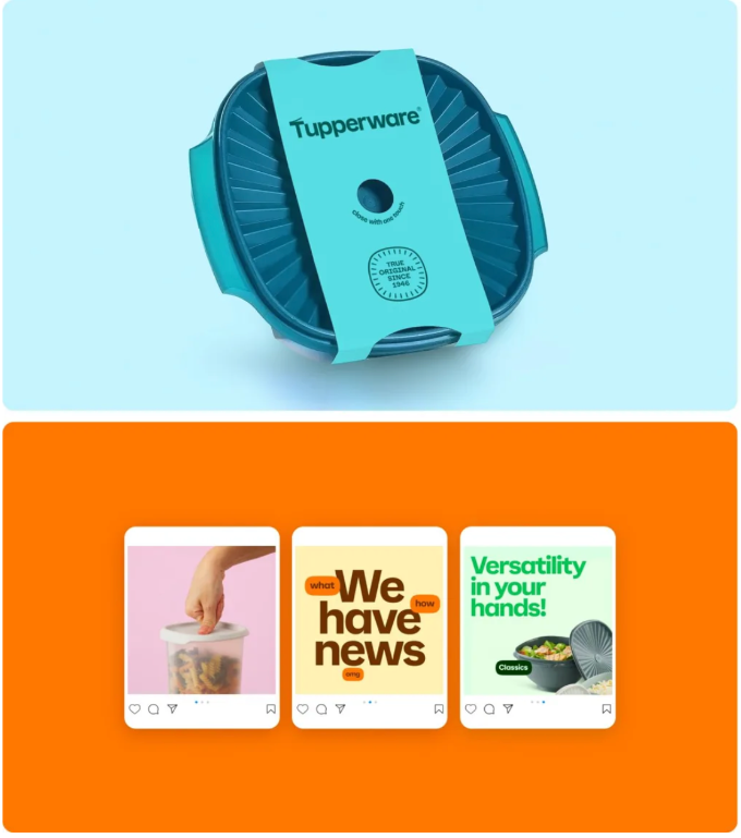
""Historically, Tupperware could count on the social equity of its sales reps to sell the brand. However, Target isn’t about to host Tupperware parties in aisle seven, so Landor has built a fresh identity with a strong shelf presence that communicates the product features that are most important to today’s consumers.
""Landor’s refresh is built on the concept of 'utility is beautiful.' Tupperware is designed with functionality, performing essential kitchen-related functions. By highlighting functionality, Tupperware clearly expresses its value proposition."" - Rudy Sanchez
The elegance and power of this system is neatly summarized in the simple flourish that has been added to letter T in the brand's logo:
(image:"https://mcusercontent.com/a931d03d317abab2d05c45d22/images/8477e11c-3259-3da6-854c-da452878d9da.png")
Article: Landor Throws a Tupperware Party (With a Brand Refresh)
(free registration required)
The brand was founded as Tupper Plastics in Farnumsville, MA in 1936. LoGoLOOK has a good history of both the company and its logos.
History: Tupperware
Visual Identity