July 5, 2024
A visual identity systems designed to empower the client team 'with the confidence and flexibility to educate and engage both the public and policymakers'.
Project Restore aspires to ""be amongst the first, globally, to move beyond habitat-by-habitat restoration, to provide an example of how multi-habitat restoration can be conducted at seascape scale to not only maximize ecological but also socio-economic benefits.""
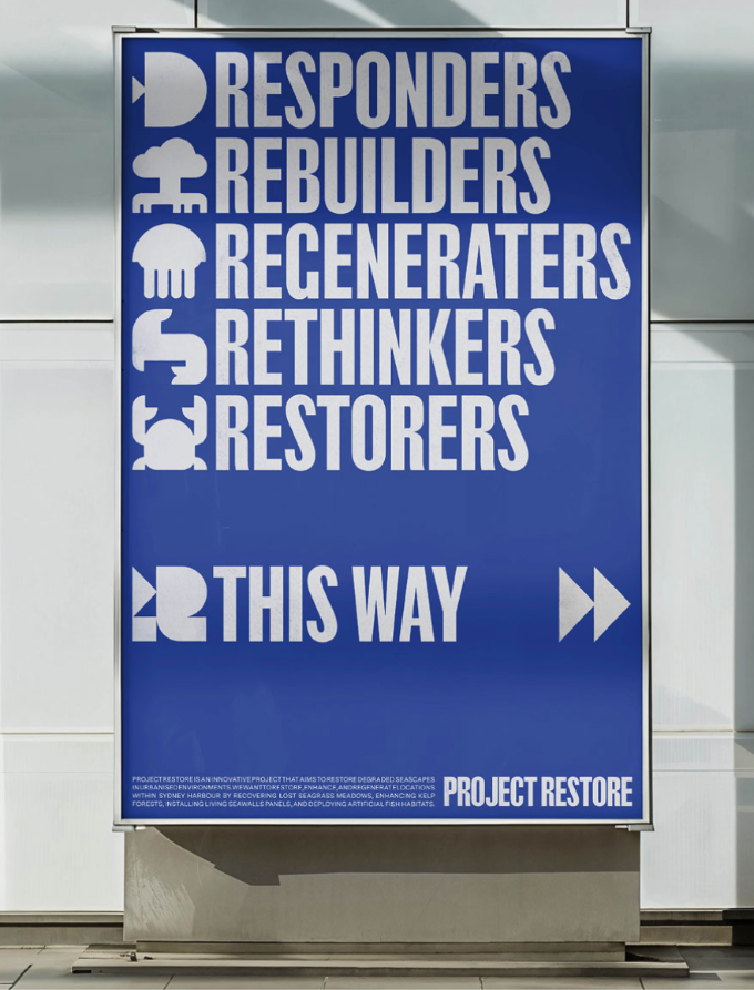
Christopher Doyle & Co. supported this effort with a strong visual identity system. ""At the heart of the new Project Restore identity is a simple but bold logomark. Combining P and R letterforms as well as a subtly embedded fish icon, the logomark serves as a symbol of restoration, regeneration, and renewal.
""Inspired by the silhouettes of marine life, we crafted a bespoke collection of textural icons to add depth and character to the identity. Whether appearing in various configurations, locked up with the logomark or standing alone, each icon references the diverse ecosystems that span the harbour and underscores Project Restore’s commitment to the holistic rejuvenation of urban waterways.""
Case Study: Project Restore
Visual Identity
No items found.

